Creating a business card is often the first step in turning your business idea into a functioning business. Since this is the first encounter with your business or brand for many potential clients, ensure it's as positive and effective as possible.
A well-designed business card carries much more than just contact information. A thoughtfully designed card leaves a trustworthy impression of you and your company with both potential clients and business partners.
Before ordering a business card or creating one, think through what that "something" is that should stand out from others -- be memorable. That "something" that won't let this card be thrown away, but makes people always keep it and ideally even demonstrate it to others...
Business Card Design Basic Rules
Next, we'll share 12 good tips to keep in mind when designing a business card. Among these are both elementary things worth being aware of and those to avoid, learning from others' mistakes. By following these tips, you can create or have created the best possible business card solution for yourself.
To be sure, we turned to Reva Print CEO Martin Mällo, who has been in daily close contact with these topics for 16 years. He reviewed top designers' recommendations and added valuable tips from his side in design, printing, and marketing.
Let's start with the business card design table of contents:
- Design that reflects the company's brand and level
- Clear and readable font style
- Optimal size and shape
- Well-organized information + focal point
- Adding added value
- Logo and brand amplification
- Use small space wisely (white space)
- Differentiation
- Marketing message (call to action)
- Check, check, and check
- Good readability in every situation
- Optimal amount of information
First and foremost advice: If you lack previous design experience, we recommend turning to a specialist, either a freelance designer or design firm. This is especially important if the company lacks a logo and visual identity guide (CVI). Otherwise, you might lose more time and money (including lost income) in the self-learning process than it would have initially cost.
As a hint, designers' hourly rate is 25-50€ depending on level. With existing CVI, creating a couple of business card variants usually takes maximum 2 hours. Without CVI, 2-4 hours.
If you have a brand guide or CVI, it already contains most of the necessary information for the print shop. In such case, you only need to choose the printing material and exact information for the card.
1. Choose business card design that reflects the brand
The business card's appearance should clearly communicate your field of activity and company essence. For example:
- A disinfectant seller's card could be sterile white and leave a clean impression, like the product/service you provide
- A graphic designer's card should reflect their style, handwriting, which obviously should be personal and distinctive
It's possible to stand out either through: color solution, material, or graphics -- our designers aim for all 3 combinations. Get familiar with business card design service.
2. Choose a font style that best allows you to communicate your message and information (clearly)
With CVI, font style solutions are usually already established. The following information is intended for those who must manage on their own and lack the opportunity to use professional designer help.
Ensuring consistency
If your company already uses a specific font style -- whether on the website, marketing materials, or packaging -- it's recommended to use the same font style on the business card. This helps maintain a unified and professional brand identity.
Field of activity's influence on font style choice
When choosing font style, proceed from your field of activity. For example, consulting service providers should prefer clear, dignified, and trustworthy font style. Meanwhile, if you're dealing with handmade candle production and sales, you should look more toward feather or calligraphic fonts.
Business card etiquette rule #1 -- readability
A business card is primarily a practical consumer graphic print. Its main function is information transmission, which is why text must be easily readable without additional aids -- whether glasses, magnifying glass, or brighter light.
Important principles of text size:
- Minimum text size should be 8pt
- For company name, avoid text over 12pt, as it might seem pushy
- As a modern trend, emphasizing the person's name has become popular, using it in equal size to the company logo or even in bold
3. Choosing business card size and shape
With card size and shape, you can emphasize traditionalism or conversely, a clear desire to stand out with a specially shaped card. At some point, things got out of hand and cards were already in the shape of rabbits, cones, lips, etc. Sometimes even a square or circle seemed like a traditional choice.
We still recommend slightly taming your creative fantasy and staying within traditional card dimensions (90 x 50 mm). This recommendation has a very compelling reason - if the card exceeds standard dimensions, the recipient is forced to slip it into a pocket or bag, because traditional wallets and business card holders don't allow secure storage of larger cards.
The already mentioned traditional-sized rectangular cards have 2 fundamental solutions -- the more common horizontal, but now also increasingly vertical position.
Within these boundaries, there are several possibilities for differentiation, such as rounding corners and various cuts, which can be made both on edges and inside the card. Many mostly emphasize company name, logo, or product shape, but there are also many decorative cuts and even graphic image plans. You shouldn't overdo all these things; they should work rather as an interesting and attention-grabbing accent, not as a heap of overdone elements.
4. Organize and specify (focus) the information and message coming on the card
The business card's main task is to carry essential contact information. We emphasize the word "essential" because that's what determines your card's effectiveness. I recommend keeping the business card's front side as clear and free from excessive sales and marketing information as possible.
Let's say the minimum allowed visual is for example:
- Company logo
- Company name
- Card owner's name
- Position
- Contact details (phone and email address)
- Also, for example, main product graphics in background or company slogan
- In Scandinavian countries, the card owner's picture is also common
Additionally, marketing-wise, exposing company social media channels is allowed. All the aforementioned information should be logically displayed in an organized manner in the aforementioned order so it's easily comprehensible/readable. We recommend preferring airy division, logo, name, position, numbers, and addresses on different lines.
The business card's back side is where you can be more creative. Usually found there:
- Larger logo
- Marketing messages
- Sales texts
- Additional visual information
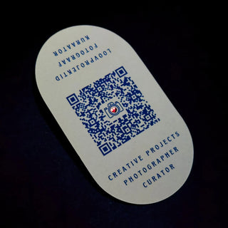
- QR code
These principles help create a business card that fulfills its main purpose.
5. Adding value to the business card
Especially for service providers, we recommend leaving part of the card surface free for use. For example, medical, massage, or beauty service providers can leave room for marking the next visit time.
The last two generations have significantly changed the nature of business cards. Many now use it as a loyalty card - the card's other side often has spaces for collecting visit stickers or stamps. Many companies also add a specific discount promise, for example, 10% discount in physical stores when showing the card or a discount code in the e-shop.
We can't fail to mention QR codes, which have opened completely new usage possibilities:
- Use as trade fair material (saving flyer printing and transport costs)
- As marketing advertising material directing to a specific homepage landing page or e-shop
Before ordering, think through your goals and the card's possible additional functions - this way you'll save both money and time in the future and avoid overloading the card with excessive information.
6. Logo and brand amplification
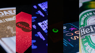
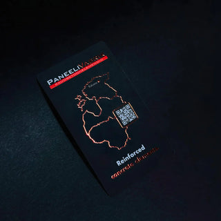
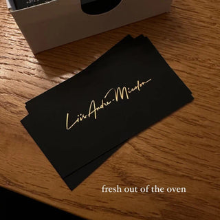
Your business card is certainly something more than just a contact information carrier. Most companies have the card's other side predominantly "reserved" for the company logo and slogan, which is the actual content-soul-essence-idea of the handed-over card. Here, print special effects are often put into play -- UV spot varnish, various foil and embossing solutions.
All this mood (vibe) that you can convey through logo and corporate style exposure through colors, card material choice, and carefully chosen font style, creates the initial connection between your potential client or partner receiving the card and your company/brand.
Main advice: if you've already made certain choices (logo, colors, font styles) on your website or other prints, stick with them. This creates experiential memory -- connection with what's been seen before, and that's how the brand's subconscious memory image is born, which is reinforced by the business card you hand over! This way you're already halfway toward CVI.
7. Use small space wisely (white space)
Don't pile your card surface with text and graphic elements or pictures. Even in music, it's said that pause works, the same can be said about air or empty space in design, which helps focus on what's important that you want to emphasize -- whether it's company logo, brand, or marketing message.
Additionally, you often need empty space for additional information that you write on the card only for selected clients or partners, for example, personal phone number or email address.
The greatest art is to convey important information minimalistically - less is more. As a result, you might be one of the few who very clearly stays in the memory of a potential client or possible business partner...
8. Add something special/distinctive
This is where it's worth thinking and weighing multiple times, sometimes even consulting. Here, seven out of ten tend to overdo it and nullify all previous advice :)
Having done everything previous correctly, this is where you look over and add as "final polish" an impactful design element, pattern, or print effect that would work like a dot on the i or cherry on the cake.
There are several possibilities for making an impact:
- Material surface treatment (structural pattern, silky or sandy surface)
- Material embossing or debossing (blind printing)
- Decorative cuts on edges or inner surface
- Rounding corners
- UV spot varnish (relief, 3D, bubbly, matte, money-readable)
- Classic or digital relief foil printing
Here too, "less is more" applies, unless you're a print effects seller :)
Important advice: if you've already chosen material with an impactful surface, add maximum two effects - one on each side!
9. Add a marketing message that would make people act (call to action)
CTA (call to action) or call to act isn't a mandatory element for business cards, but as we mentioned, the last 2 generations have changed the nature of business cards. Today it's no longer just a contact information carrier, but with marketers' advice can instantly become:
- Client card
- Discount card
- Gift card
The already mentioned addition of QR code creates dozens of possibilities for card usage, including the possibility to call people to action. For example, you can direct a potential client through QR code to your e-shop's special offers page, where a limited-time discount offer awaits them, for example 50% discount.
10. Check everything and test once more
Check and check again all QR codes, phone numbers, company names, people's names, etc. It sounds logical but unfortunately such mistakes occur from time to time. With a marketing card, test and test again the card's functionality on the target group. Whether it's an existing client or some acquaintance who might belong to the target group. With QR codes, we recommend double-checking that it's not a short-term code. You can create timeless QR codes for example in Canva.
11. Business card etiquette rule -- easy readability of information
Avoid complex font styles and too small text (under 8pt). Think about this: would you like it if you arrive at a meeting and want to clarify the address from the card, but discover you can't read it without causing an accident? That's exactly what's meant -- information must be clearly and easily readable.
12. Avoid excessive information and graphics piling on an already small surface
We've already talked about this a lot, but leave the card solution waiting for a moment -- even for one day. Then look at it with fresh eyes, asking yourself all the aforementioned questions again. If you're still satisfied with the result, the card is ready for printing! Send inquiry here.
Finally, print shop requirements:
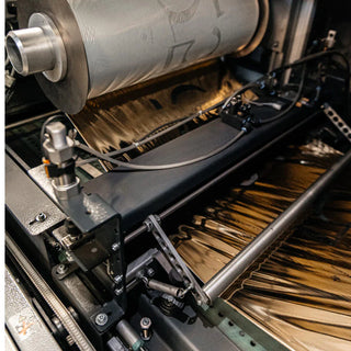
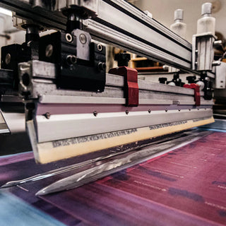
For printing, we need a print file in pdf X1-4 format, where the design must not be an image but vector graphics.
Each page separately for business card side and effects on separate pages.
NB! Don't forget cut marks (also on print effect pages, because that's the only thing that finally brings design and print together) and 3mm bleed or overlap from the printed surface. Learn more about preparing print files here.
FAQ
What are business card etiquette rules?
Most important is that business card text is well readable -- don't use smaller font than 8pt. When handing over a business card, international custom applies: extend the card with your right hand and turn it so the recipient immediately sees contact details. This shows respect and professionalism.
A bit about cultural differences too. For example, in Japanese culture, a business card is received with two hands and extended with two hands, bowing slightly forward.
What is the correct business card format?
In the EU, the most common format is 90x50mm, in the USA 85x55mm. Although today you also encounter square and circular business cards, we recommend staying within 90x50mm format boundaries -- these fit nicely in wallets.
How to stand out with a business card?
- Text - message and its presentation method
- Visual - graphic design and design elements
- Material - paper or other material choice
- Special effects - the cherry on top is the use of special effects, of which 46 different print effects can be applied in our house
What to do and what to avoid with business cards?
We recommend:
- Ensure data is clearly readable
- Thoughtful layout
- Add multiple contact methods
- Use QR code
We don't recommend:
- Avoid handwriting (except loyalty cards, medical and beauty service cards)
- Avoid excessive information like multiple phone numbers, email addresses, or homepages
Additionally, create a habit of carrying at least five business cards with you everywhere.
What is the best program for designing business cards?
Naturally, our first recommendation is to use specialists' help, whether a freelance designer or design firm. Based on recommendations, the highest quality programs for this are Adobe (design package) of which the best is Illustrator or Corel (design package) of which Draw.
For simple users, many possible helpers can be found online and their number is constantly growing.
The most known of these are:
- Canva
- Vista Create
- Adobe Express
- Figma