Creating a business card is often the first step in turning your business idea into a functioning business. Since this is the first encounter many potential clients will have with your business or brand, ensure that it's as positive and effective as possible.
A well-designed business card carries much more than just contact information.
A thoughtfully designed card leaves a trustworthy impression of you and your company to both potential clients and business partners.
Before ordering or creating a business card, think about what "something" should distinguish your card from others – what will make it memorable. That "something" that prevents the card from being thrown away, but always ensures it's kept and ideally even shown to others...
Basic Business Card Design Rules
Next, we'll share 12 good tips to keep in mind when designing a business card. These include both elementary things to be aware of, as well as those to avoid, learning from others' mistakes. By following these tips, you can create or have created for you the best possible business card solution.
To be sure, we turned to Martin Mällo, CEO of Reva Print, who has been closely involved with these topics on a daily basis for 16 years. He reviewed recommendations from top designers and added his own valuable tips from design, printing, and marketing fields.
Let's start with the business card design table of contents:
- Design that reflects the company's brand and level
- Clear and readable font
- Optimal size and shape
- Well-organized information + focal point
- Adding value
- Enhancing logo and trademark
- Using small space wisely (white space)
- Differentiation
- Marketing message (call to action)
- Check, check, and check again
- Good readability in all situations
- Optimal amount of information
- First and additional advice
If you lack previous design experience, we recommend consulting a specialist – a freelance designer or design firm. This is especially important if the company lacks a logo and visual identity guide (CVI). Otherwise, the self-learning process may cost more time and money (including lost revenue) than it would have initially cost.
As a hint, designers typically charge €25-50 per hour depending on their level. With an existing CVI, creating a couple of business card variants usually takes a maximum of 2 hours. Without a CVI, it takes 2-4 hours.
If you have a brand guide or CVI, it already contains most of the necessary information for the printing house. In that case, you only need to choose the printing material and the exact information for the card.
1. Choose a Business Card Design that Reflects Your Brand
The appearance of your business card should clearly communicate your field of activity and the nature of your company. For example:
- A disinfectant seller's card could be sterile white and leave a clean impression, like the product/service you provide
- A graphic designer's card should reflect their style, handwriting, which obviously should be personal and distinctive
You can differentiate through: color solution, material, or graphics – our designers aim for all 3 combinations. Explore our business card design service.
2. Choose a Font Style that Best Communicates Your Message and Information (Clearly)
With a CVI, font solutions are usually already established. The following information is for those who need to manage on their own and don't have access to a professional designer.
Ensuring consistency
If your company already uses a certain font style – whether on the website, marketing materials, or packaging – it's advisable to use the same font style on the business card. This helps maintain a unified and professional brand identity.
The impact of your field on font selection
Base your font choice on your field of activity. For example, consulting service providers should prefer a clear, restrained, and trustworthy font style. However, if you're involved in handmade candle production and sales, you should look more towards pen or calligraphic fonts.
Business card ethics rule #1 – readability
A business card is primarily a practical utility graphic print. Its main function is to convey information, so the text must be easily readable without additional tools – be it glasses, a magnifying glass, or brighter light.
Important principles of text size:
- Minimum text size should be 8pt
- For company names, avoid text over 12pt as it may seem intrusive
- As a modern trend, emphasizing the person's name has become popular, using it in equal size to the company logo or even in bold text
3. Choosing the Business Card Size and Shape
With the card size and shape, you can emphasize traditionalism or, conversely, a clear desire to stand out with a special-shaped card. At one point, there was a trend of cards shaped like rabbits, cones, lips, etc. Even square or round seemed like traditional choices at times.
We recommend taming your creative fantasy somewhat and staying within the traditional card dimensions (90 x 50 mm).
This recommendation has a very compelling reason - if the card exceeds standard dimensions, the recipient is forced to put it in a pocket or bag, as traditional wallets and business card holders don't allow for secure storage of larger cards.
The already mentioned traditional rectangular cards have 2 fundamental solutions – the more common horizontal, but now increasingly vertical orientation.
Within these boundaries, there are many opportunities for differentiation, such as rounding corners and various cutouts that can be made both at the edges and inside the card. Many usually emphasize the company name, logo, or product shape, but there are also many decorative cuts and even graphic image planes. Don't overdo it with all these things; they should function more as an interesting and attention-grabbing accent rather than an overdone pile of elements.
4. Organize and Specify (Focus) the Information and Message on the Card
The main task of a business card is to carry essential contact information. We emphasize the word "essential" because this determines the effectiveness of your card. I recommend keeping the front of the business card as clear and free from excessive sales and marketing information as possible.
Let's say the minimum allowed visual is, for example:
- Company logo
- Company name
- Card owner's name
- Position
- Contact details (phone and email address)
- Also, for example, main product graphics in the background or company slogan
- In Scandinavian countries, the card owner's picture is also common
Additionally, it's marketing-wise permissible to display the company's social media channels. All the above information should be logically exposed in the aforementioned order so that it's easily grasped/read. We recommend preferring an airy structure, with the logo, name, position, numbers, and addresses on different lines.
The back of the business card is where you can be more creative. Typically, you'll find there:
- Larger logo
- Marketing messages
- Sales texts
- Additional visual information
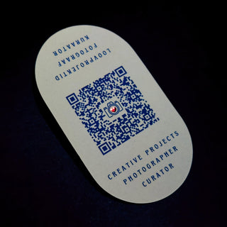
- QR code
These principles help create a business card that fulfills its main purpose.
5. Adding Value to Your Business Card
Especially for service providers, we recommend leaving part of the card surface free for use. For example, medical, massage, or beauty service providers can leave room for marking the next visit time.
The last two generations have significantly changed the nature of the business card. Many now use it as a loyalty card - the other side of the card often has spaces for visit stickers or stamps. Also, many companies add a specific discount promise, such as 10% off in physical stores upon presenting the card or a discount code for online stores.
We can't forget to mention QR codes, which have opened completely new usage possibilities:
- Use as trade show material (saving flyer printing and transportation costs)
- Marketing advertising material directing to a specific website landing page or e-shop
Before ordering, think through your goals and possible additional functions of the card - this will save you both money and time in the future and avoid overcrowding the card with excessive information.
6. Enhancing Logo and Trademark on the Business Card
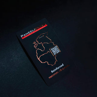
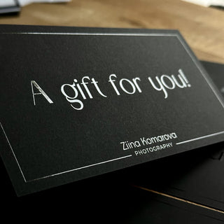
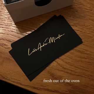
Your business card is definitely something more than just a carrier of contact details. For most companies, the other side of the card is predominantly "reserved" for the company logo and slogan, which is the actual content-soul-essence-idea of the card being handed over. This is often where special print effects come into play – UV spot varnish, various foil, and embossing solutions.
All this mood (vibe) that you can convey by displaying the logo and company style through colors, card material selection, and carefully chosen font style creates the initial connection between the potential client or partner receiving your card and your company/brand.
Main advice: if you've already made certain choices (logo, colors, font styles) on your website or other printed materials, stick with them. This creates experiential memory – connection with what has already been seen before and thus creates the subconscious memory image of the brand, which is reinforced by the business card you hand over! So you're already halfway towards a CVI.
7. Use Small Space Wisely (White Space)
Don't overcrowd your card surface with text and graphic elements or images. Even in music, it's said that a pause works; the same can be said in design about air or empty space, which helps focus on what you want to emphasize – be it the company logo, trademark, or marketing message.
Additionally, you often need empty space for additional information, which you write on the card only for selected clients or partners, such as a personal phone number or email address.
The greatest art is to convey important information minimally - less is more. As a result, you might be one of the few who very clearly stays in the mind of a potential client or possible business partner...
8. Add Something Special/Distinctive
This is where it's worth thinking and considering multiple times, sometimes even consulting. Here, seven out of ten tend to overdo it and nullify all previous advice :)
Having done everything else correctly, this is where you review and add as a "final touch" an impactful design element, pattern, or printing effect that would work like a dot on the i or a cherry on the cake.
There are several ways to make an impact:
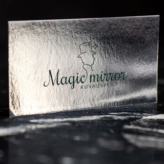
- Material surface treatment (structural pattern, silky or sandy surface)
- Material embossing or debossing (blind printing)
- Decorative cuts on edges or internal surface
- Rounding corners
- UV spot varnish (embossed, 3D, bubbly, matte, readable under UV light)
- Classic or digital raised foil printing
Here too, "less is more" applies, unless you're a seller of printing effects :)
Important advice: if you've already chosen a material with an impressive surface, add a maximum of two effects - one on each side!
9. Add a Marketing Message that Would Make People Act (Call to Action)
CTA (call to action) is not a mandatory element for business cards, but as we mentioned, the last 2 generations have changed the nature of business cards. Today, it's no longer merely a carrier of contact information but can, with marketers' advice, instantly transform into:
- A customer card
- A discount card
- A gift card
The already mentioned addition of a QR code creates dozens of possibilities for the card's use, including the opportunity to invite people to act. For example, through the QR code, you can direct a potential client to your e-shop's special offers page, where a limited-time offer awaits, such as a 50% discount.
10. Check Everything and Test One More Time
Check and recheck all QR codes, phone numbers, company names, people's names, etc. This sounds logical, but unfortunately, such mistakes occasionally happen. For a marketing card, test and retest the card's effectiveness on the target group. Whether it's an existing client or an acquaintance who might belong to the target group. For QR codes, we recommend double-checking that it's not a short-term code. You can create non-expiring QR codes, for example, on Canvas.
11. Business Card Ethics Rule – Easy Readability of Information
Avoid complex fonts and text that's too small (under 8pt). Think about it: would you like it if you arrived at a meeting and wanted to clarify an address from the card, but discovered you couldn't read it without causing an accident? That's precisely what's meant – information must be clearly and easily readable.
12. Avoid Excessive Information and Graphic Overloading on an Already Small Surface
We've already talked about this a lot, but leave the card solution on hold – even for a day. Then look at it with fresh eyes, asking yourself all the aforementioned questions again. If you're still satisfied with the result, the card is ready for printing!
Send an inquiry here.
Finally, Printing House Requirements:
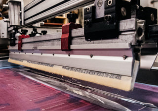
For printing, we need a pdf X1 - 4 format print file, where the design should not be an image but vector graphics.
Each page should have a separate business card side, and effects on separate pages.
NB! Don't forget cutting marks (also on the print effect pages, because that's the only way the design and print finally come together) and 3mm bleed or overlap from the printable surface. Learn more about print file preparation here.
FAQ
What are the Business Card Etiquette Rules?
It's paramount that the business card text is easily readable – don't use a smaller font than 8pt. When handing over a business card, an international custom applies: extend the card with your right hand and turn it so that the recipient immediately sees the contact information. This shows respect and professionalism.
A bit about cultural differences. For example, in Japanese culture, a business card is received with both hands and handed over with both hands, bowing slightly forward.
What is the Right Business Card Format?
In the EU, the most common format is 90x50mm, in the USA 85x55mm. Although nowadays you also encounter square and round business cards, we recommend staying within the 90x50mm format – these fit nicely between wallets.
How to Stand Out with a Business Card?
- Text - message and its presentation style
- Visuals - graphic design and design elements
- Material - choice of paper or other material
- Special effects - the cherry on the cake is the use of special effects, of which in our house, it's possible to apply as many as 46 different printing effects
What to Do and What to Avoid with a Business Card?
We recommend:
- Ensure that the data is clearly readable
- Well-thought-out layout
- Add multiple contact methods
- Use a QR code
We don't recommend:
- Avoid handwriting (except for loyalty cards, medical and beauty service providers' cards)
- Avoid excessive information such as multiple phone numbers, email addresses, or websites
Additionally, create a habit of carrying at least five business cards with you everywhere.
What is the Best Program for Designing a Business Card?
Of course, our first recommendation is to use the help of specialists, be it a freelance designer or a design firm. Based on the recommendation, the highest quality programs for this are Adobe (design package), with Illustrator being the best, or Corel (design package), with Draw from it.
For the simple user, there are many possible helpers online, and their number is constantly growing.
The most famous among them are: